Can a Color Analysis Help You to Look Your Best After 60? You Bet!
Last weekend I had a life-changing experience: while attending a training session on color analysis, I found out that I’ve been wearing the wrong palette for over 20 years.
With all that’s going on in the world today, this error might sound trivial to you. But as a woman who prides herself in looking her best whenever she leaves the house, I was shocked by this news.
Although I “had my colors done” more than 20 years ago, when color analysis was in vogue, I was given the wrong diagnosis. Instead of being a Summer (which is a cool palette), I am in fact a Warm Autumn, a palette with a golden undertone that is between Spring and Autumn.
If these terms are unfamiliar to you, let me explain.
What is Color Analysis?
Color analysis is the process of identifying the colors that will be most flattering to a person, based on her or his skin tone, natural hair color, and eyes. Suzanne Caygill first brought to the public’s attention the Seasonal System of Color Analysis in 1980, when she published Color: The Essence of You.
This system categorizes people into four seasons, based on the undertone of their skin. Those with a cool (blue) undertone are Winter or Summer; those with a warm (yellow) undertone are Autumn or Spring. More recently, the four seasonal palettes have been expanded into 16, to take into account the fact that many people have coloring characteristics common to more than one season.
Why Worry About Color?
Karen Brunger, a leader in the industry today, answers this question: “As an image consultant, I consider colour to be the most important element in having my clients appear their very best. Colour can help us appear healthier, more alive, personally powerful, and in harmony with ourselves. Conversely, colour can make us appear jaundiced, anemic, unhealthy, insipid, and jarring.”
Putting the Rules into Practice
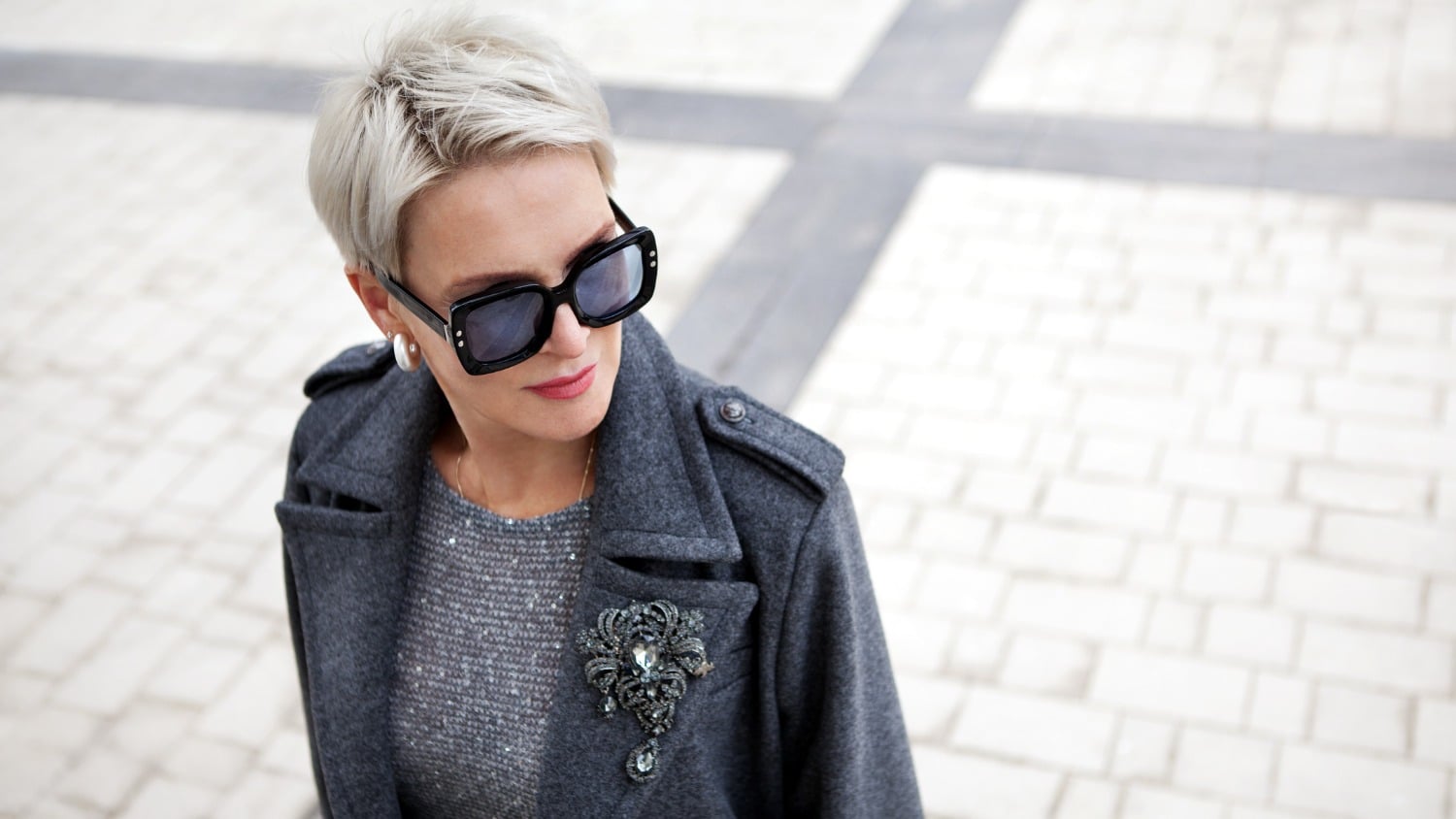
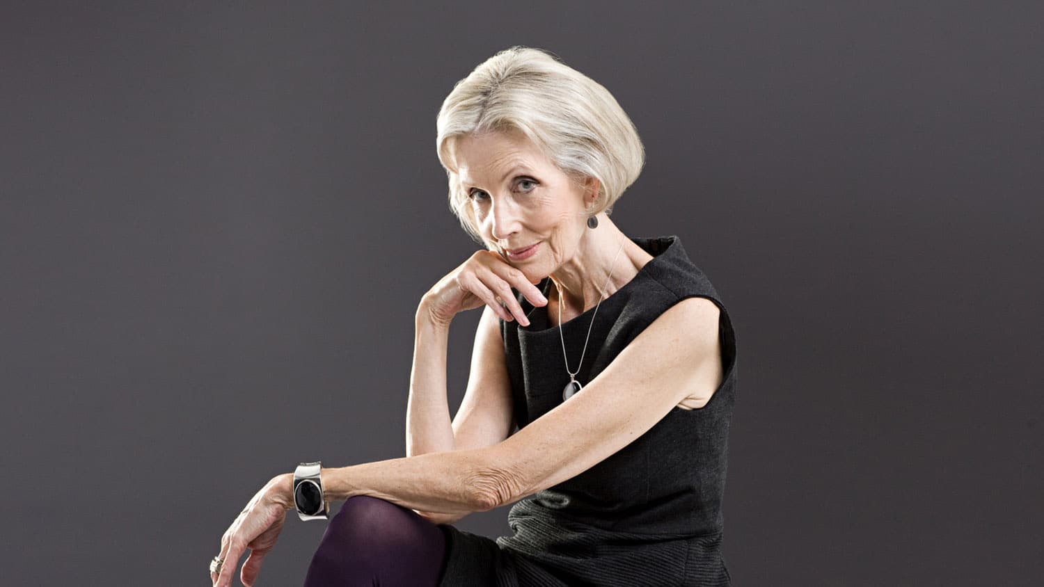
The correct color palette applies to everything we wear: clothing, accessories – including jewelry, shoes, and handbags – and make-up, including nail polish. It also applies to changes we make to our natural hair color. Fortunately, my colorist has been doing his job correctly, and my hair color is fine. But my make-up needs to be corrected – my eye shadow and blush are wrong.
As for clothing and shoes, these charts from What to Wear/How to Dress illustrate to some extent where my wardrobe is, with the Summer palette on the left, and where it needs to go, toward the Warm Autumn palette in the chart on the right.
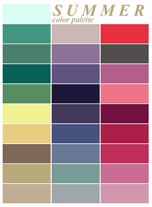
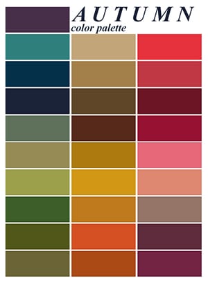
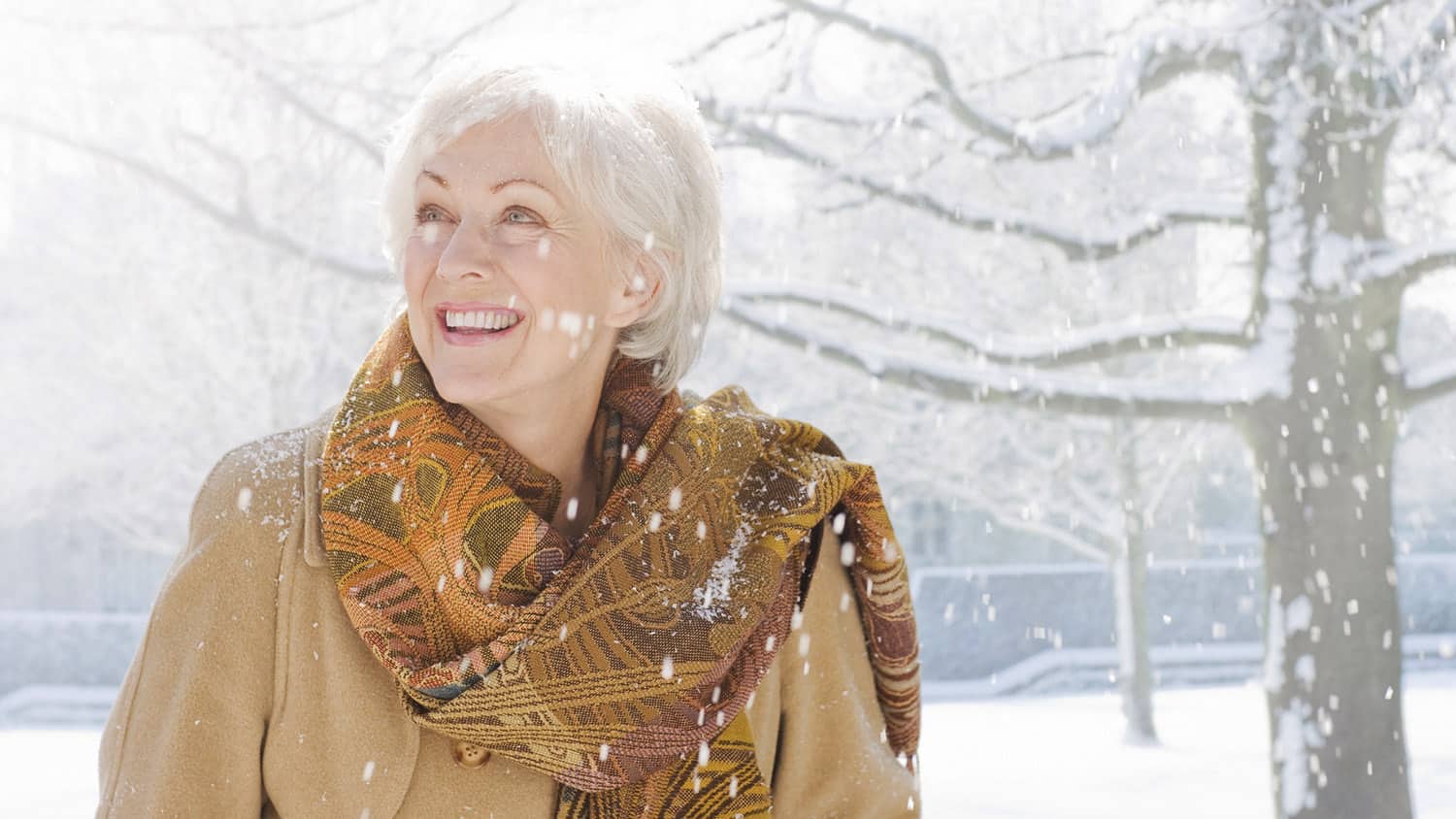
I’ll be saying goodbye to black, greys, and most blues. I’ve always avoided pastel pinks, yellows, and greens, so they’re no problem, but I’ll miss magenta and fuchsia. At least I’ve always liked teal, brown, and taupe, so I will have some items of clothing once the purge is complete. The biggest change will be the addition of colors such as rust, orange, and mustard, which I never expected to wear.
This transition won’t be easy. I practically live in black trousers, I love greys – and my three pairs of silver shoes – and I have lots of inappropriate blues. In fact, I had always thought that any blue was flattering because of my blue eyes, but the women in my course set me straight on that idea.
When I arrived on the second day wearing a brown leather jacket with a gold sheen, several classmates told me that I looked more energized than I had the day before when I was wearing my blue paisley jacket and lapis earrings.
Addressing the Jewelry Dilemma
And what about my jewelry? I moved away from yellow metals to white ones many years ago. But my palette book specifies yellow gold, brass, and copper, as well as creamy pearls and gemstones that match my colors.
Here is the problem: as a collector and retailer of vintage costume jewelry, I know that the color of metal used in vintage pieces is tied to the style of the jewelry. For example, in Art Deco jewelry (1920s to late-1930s) – my favorite style and the bulk of my personal collection – white metals were mainly used.
Retro Modern jewelry, the style most common from the late 1930s through the late 1940s, was usually made in yellow- or rose-gold-plated metals. And since the stones and beads for vintage pieces were created in all gemstone colors, as well as man-made hues, much of the jewelry from any era combines warm and cool.
So, after considerable thought and consultation with my instructor, I’ve decided to choose the jewelry to keep on the basis of the stone color rather than the metal. That means that I’ll no longer wear costume pieces in all chrome or silver.
With this strategy in mind, I’ll be able to look my best and also give sage advice to my readers and my clients. After all, that’s why I took the course in the first place.
Have you had your colors done recently? What is your favorite color to wear? Do you know if it is in your seasonal palette? Please join this colorful conversation!