Feng Shui and the Psychology of Living in Color
We are surrounded by color, everywhere, all the time. Psychology tells us that color affects our moods and perceptions (including how things taste and smell to us), marketing tells us that color affects our buying habits, and business claims that color affects worker productivity.
Art and design offer color theory, which uses a color wheel – a circular rainbow – to show colors in relation to one another and explain concepts like hue, tint, shade, and intensity.
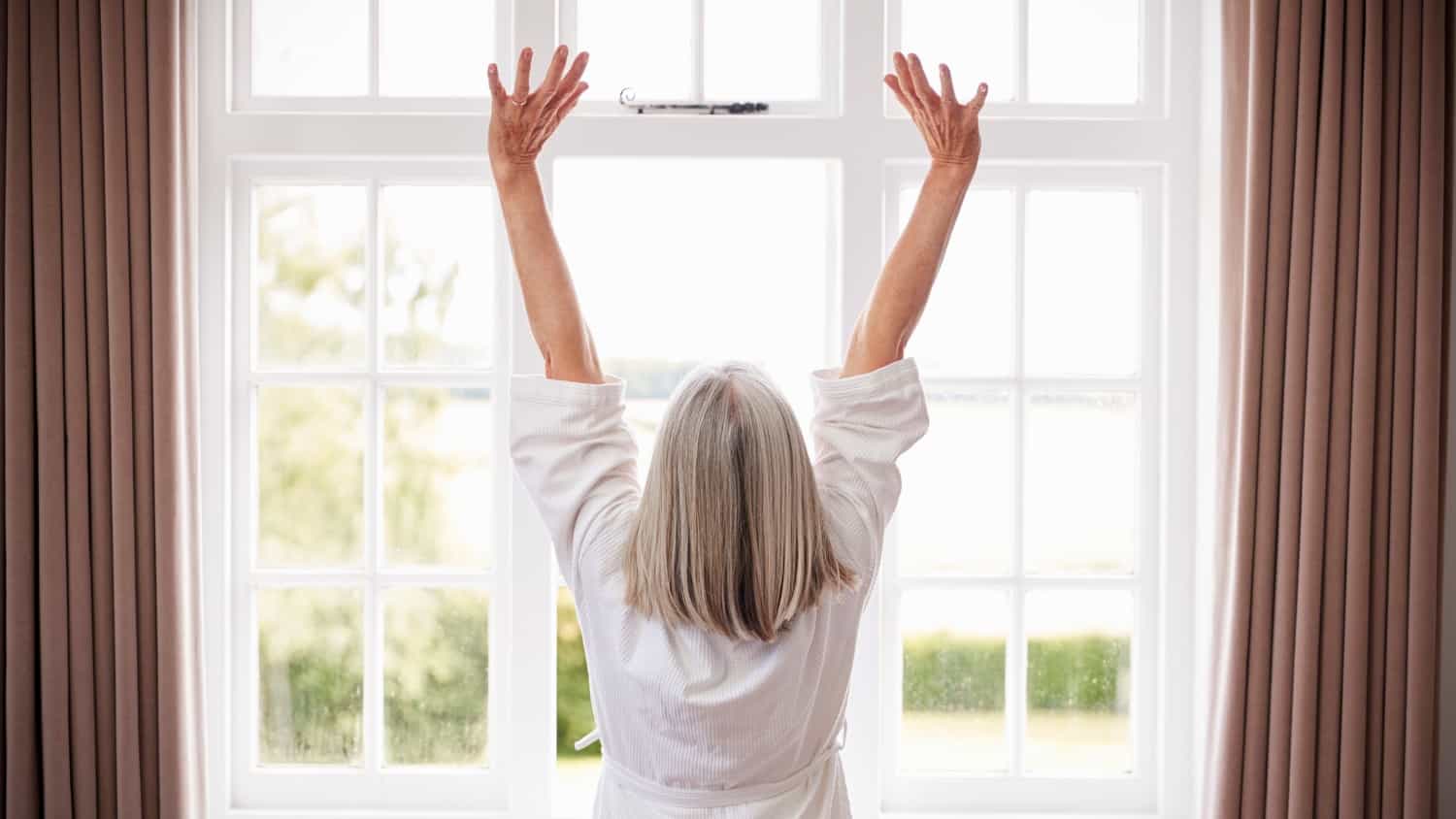
Colors can encourage or dampen feelings of anger, calm, excitement, fear, anxiety, joy, or even hunger. They can help us sleep, study, or express ourselves creatively. Colors are everywhere, and they make a difference to us.
Color in the Philosophy of Feng Shui
In Feng Shui, colors denote energies. For example, purple symbolizes wealth, while pink signifies love. Nine colors, assigned to nine physical spaces in your home, create its Feng Shui bagua, a map of energetic areas and their corresponding colors.
Feng Shui practitioners use this map to help activate energies that may get stuck and to make sure the flow of energy is clear throughout a home. In simple terms, this might mean that if you are having relationship problems, we would look to your Relationship area and, perhaps, add some pinks there.
The Five Elements – Fire, Metal, Water, Wood, and Earth – are also associated with colors and the makeup of your home’s bagua. Fire is seen in reds, Metal in whites and pastels, Water in black and dark blue, Wood in greens and browns, and Earth in yellows, tans, and earth tones.
We choose the colors that surround us in our homes through paint, furniture, upholstery, linens, art, plants, dishes, lighting, and all our décor items.
We choose the colors of our clothing and accessories, cars, bikes, yoga mats, and even the ink in our pens. A lot of the time, we don’t pay much attention to these choices, much less their effect on us.
The 2020 Pantone Color
The Pantone 2020 “Color of the Year” is Classic Blue, and we can expect to see it on fashion runways and in decorating trends, including paint and fabrics. Explaining why they chose it for this year, Pantone says:
“Suggestive of the sky at dusk, the reassuring qualities of the thought-provoking PANTONE 19-4052 Classic Blue highlight our desire for a dependable and stable foundation on which to build as we cross the threshold into a new era.”
Furthermore, Classic Blue is “imprinted in our psyches as a restful color” because it “brings a sense of peace and tranquility” and “re-centers our thoughts,” helping concentration and clarity.
Compare this to Pantone’s words describing their 2019 color, Living Coral, which included “warmth,” “buoyancy,” “optimism,” “joyful,” “sociable,” “lighthearted,” and “playful.”
Clearly, the Pantone Institute believes that 2020 will bring a more serious vibe, and that we need a sense of stability and calm, as we are moving into a new, unknown, “era.”
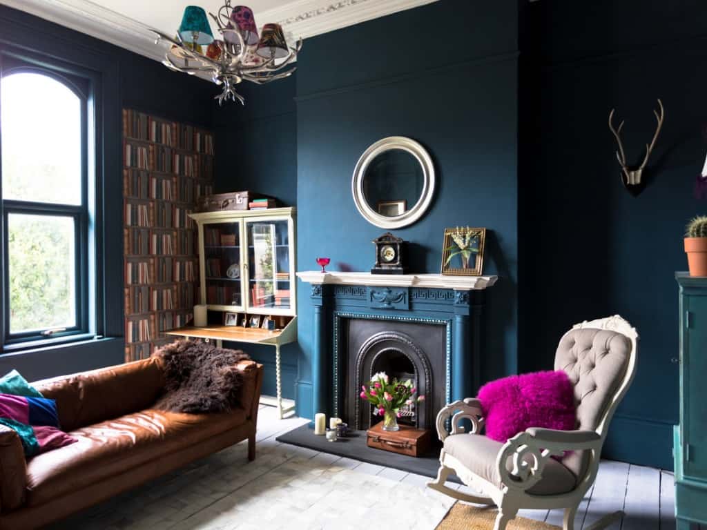
In Feng Shui, blue – especially its darker tones – represents our inner life, including knowledge, wisdom, and spirituality. It also aligns with the Element of Water, offering calm energy, like water beneath the surface.
The Water Element also represents prosperity and abundance. The Year of the White Metal Rat looks to be a year of prosperity, with influences from both Metal and Water Elements.
Classic Blue Is a Truly Fitting Color for This Year
So, in 2020, how can we bring blue into our homes in the best possible ways? First off, find the Knowledge area of your home. Divide a square into nine equal parts, in three rows of three squares.
The bottom line is the wall where lies your front door. The bottom left ninth is your Knowledge, Wisdom, Personal Development, and Spirituality area. The power color here is blue.
As you move to the center of this front wall, you enter the Career area, which is the adjoining area, dominated by the color black and the Water Element.
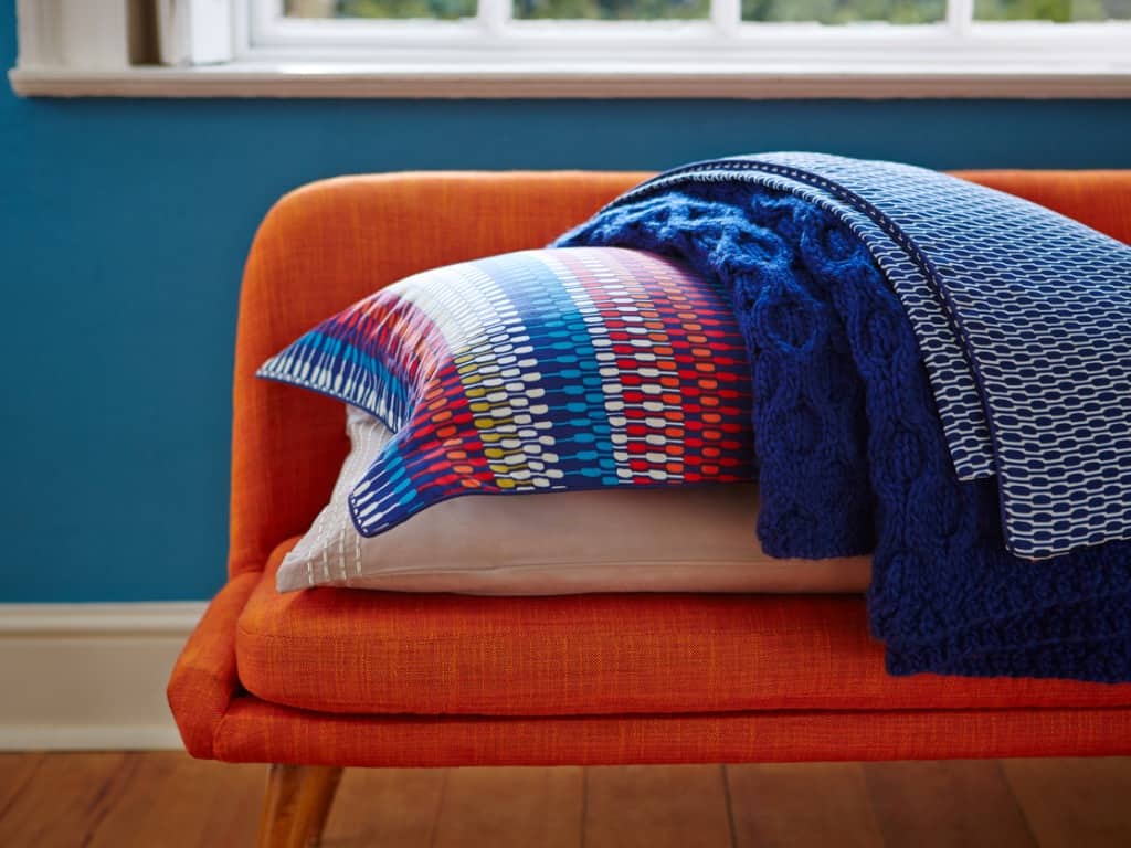
These are the two areas where you can use Classic blue to its fullest advantage. Think rugs, curtains, upholstery, pillows, artwork, lamps, knickknacks, and of course, paint.
Now move throughout your home, adding smaller items to bring in blue, particularly in the Knowledge and Career areas for each room (using the room’s door as a front door and laying the bagua accordingly).
Wood and Water are compatible (Water feeds Wood) and symbolizes growth (such as growing prosperity), so as you move up the left side of your bagua, add blue to your Family and Wealth areas, as these areas are where the Wood Element is strongest. Water douses Fire, so go easy on adding blue to the far center area of the home.
Classic Blue is the perfect color for 2020, stimulating prosperity and peacefulness, so use it to decorate or refresh your home. Think about it when buying new sneakers, dishes, or even a toothbrush. Keep the energetic pathways clear, allowing abundance to inflow and outflow, just like the deep blue sea.
What does 2020 look like for you thus far? Is it serious or cheerful? How are you planning to use blue in your home? Please share your thoughts and ideas with the community!